free shipping at $99


If you want more sales from the people already visiting your site, guesswork isn't going to cut it. It all comes down to a systematic, data-driven approach.
Improving ecommerce conversion rates really boils down to three things: optimizing the user experience, building unshakable trust, and getting rid of every last bit of friction along the path to purchase. Get those right, and you'll start turning casual browsers into loyal customers.

So many online stores just throw random tactics at the wall, hoping something sticks. They might copy a competitor’s pop-up or run a big sale without really understanding why their conversion rates are low in the first place. This kind of reactive, "guess and test" method is exactly why most efforts fizzle out without any real, long-term results.
A winning strategy, on the other hand, starts with a solid foundation. It's about diagnosing the problem before you even think about prescribing a solution.
Before you can start improving, you need a crystal-clear picture of where you stand right now. A "good" conversion rate isn't some magic number; it totally depends on your industry, your price points, and who you're selling to. For a deeper dive, checking out some conversion rate optimization best practices can give you a ton of actionable ideas.
Chasing a generic conversion rate goal is like sailing without a map. Instead, focus on making small, steady gains against your own past performance and industry benchmarks. That’s where the real, sustainable growth happens.
As we move through 2025, the average eCommerce conversion rate for online stores is hovering somewhere between 2% and 4%. But that number can be misleading because it changes so much from one industry to the next.
To get a real sense of your performance, you need to compare apples to apples. This table gives a quick look at average conversion rates across different ecommerce sectors.
| Industry | Average Conversion Rate |
|---|---|
| Personal Care | 6.8% |
| Arts & Crafts | 4.0% |
| Food & Beverage | 3.6% |
| Pet Care | 3.3% |
| Fashion & Apparel | 1.9% |
| Home Decor | 1.4% |
See how different they are? The personal care world sees a healthy 6.8%, while home decor (1.4%) and fashion (1.9%) are much lower, often because people take longer to decide on those purchases. This just goes to show how important context is. Knowing your industry’s benchmark is the first step to smart optimization.
Instead of just trying random things, a structured framework makes sure your efforts are targeted and actually get results. This guide is all about moving past generic advice to give you a clear roadmap.
Here’s what a successful plan looks like:
By adopting this kind of systematic thinking, you stop guessing what might work and start knowing what will. This guide is your framework for doing exactly that.

Go ahead and peek at your site analytics. I’ll bet you see a crystal-clear trend: most of your visitors are showing up on a smartphone. That’s no surprise, but here’s the million-dollar question—are they actually buying anything? For a lot of online stores, the answer reveals a painful, costly gap between all that mobile traffic and the actual sales it generates.
This isn't just some minor detail; it's a huge obstacle blocking your conversion rates from growing. The numbers tell the story. Data shows that a whopping 73% of eCommerce traffic comes from mobile, but the conversion rate on those phones is a measly 2.9%. Compare that to 4.8% on desktop, and you can see why mobile usability isn't just a "nice-to-have" anymore. It's everything.
Fixing this means you need a dedicated strategy that’s all about the handheld experience. It's time to move beyond a design that just "works" on a phone to one that feels completely natural and effortless for someone scrolling with their thumb.
First things first, you have to get inside the head of a mobile user. They’re interacting in a totally different way—tapping, swiping, and scrolling on a tiny screen, probably while they’re distracted by something else. If your site isn't built for that reality, you're going to frustrate them right away, and they'll be gone in a flash.
Think about the classic mobile frustrations. Cluttered menus with links so small you can't tap the right one, product photos you can’t zoom in on, and forms that make you pinch and scroll endlessly. These are total conversion killers. The goal is to make everything feel seamless.
Here are a few things to really zero in on for a touch-friendly design:
A huge part of this is building effective mobile landing pages to make sure that first impression counts.
On mobile, speed and simplicity are the name of the game. A customer’s path from a product page to a completed purchase should have as few steps as humanly possible. Every extra screen they have to load or field they have to fill out just gives them another reason to leave.
Imagine someone finds a Jackpot Candle they love on their phone. They want to toss it in their cart and check out, simple as that. They’re not looking for a drawn-out, complicated process. This is where mobile-native features can be a game-changer for your conversion rates.
Don't just shrink your desktop checkout and cram it onto a mobile screen. You need to build a mobile checkout from the ground up, focusing on speed, security, and one-tap payment options.
This means integrating mobile wallets is non-negotiable. Giving customers options like Apple Pay and Google Pay lets them skip the nightmare of typing in credit card numbers and shipping info. They can just use their fingerprint or face to authenticate, and the purchase is done in seconds.
Finally, go through every single part of your mobile site with a fine-tooth comb and hunt for friction. Your mission is to make the entire process so smooth that buying something feels like the easiest, most natural thing to do.
Here are a few high-impact fixes to consider:
When you obsess over these little details, you turn your mobile site from a clunky portal into a genuine conversion machine.

Let's be honest—no matter how gorgeous your website is or how incredible your products are, a customer who doesn't trust you will never pull out their credit card. Trust isn't just a nice-to-have; it's the absolute foundation of ecommerce. If you want to improve your conversion rates, this is where you start.
This whole process kicks off the second a visitor lands on your site. They’re subconsciously scanning for signals that tell them your store is legit, professional, and safe. Every single element, from your logo to your return policy, either builds that feeling of confidence or starts chipping away at it.
You can't just slap a few security badges in the footer and call it a day. Building real, unshakable trust takes a much more thoughtful approach, woven into every part of the customer's journey.
One of the most powerful tools in your trust-building toolkit is social proof. When potential buyers see that other people have already purchased from you and had a great experience, their hesitation just melts away. It validates their interest and makes the whole purchase feel way less risky.
But simply having reviews isn't enough; you need to show them off effectively. Drowning your product pages in a wall of text can actually backfire. Instead, think about strategic placement.
When a new customer sees a review that says, "I was so excited to find my sapphire ring inside—it's beautiful!" it does more than just sell a candle. It sells an experience and builds a powerful, emotional connection that a simple product description never could.
This kind of user-generated content feels genuine because it is. It’s not your brand talking; it’s a community of happy customers, which is always more persuasive.
Nothing kills trust faster than uncertainty. If a customer has to dig around for your shipping policy or can't figure out how to make a return, they're going to assume the worst and bounce. Transparency is your best friend here.
Your policies shouldn't be hidden behind pages of legal jargon. They need to be simple, easy to find, and written in plain English that anyone can understand.
Make sure you have dedicated, easy-to-find pages for:
Linking to these policies in your site’s footer is standard practice, but you should also bring them up at key moments. Add a small note like "Easy 30-Day Returns" right under the "Add to Cart" button or include a link to shipping info directly in the shopping cart. These little reassurances make a huge difference.
At the end of the day, people want to buy from real people, not a faceless company. Showing the human side of your business is a simple but incredibly effective way to build a real connection and boost your credibility.
Your "About Us" page is a golden opportunity. Don't just list your company's history; tell your story! Why did you start this business? What do you believe in? Sharing your passion helps customers feel like they're part of something special.
Clear and accessible contact information is also non-negotiable. Give customers multiple ways to reach you—like an email address, a contact form, and a phone number. This shows you're available and ready to help, which is incredibly reassuring.
For brands like Jackpot Candles, explaining the unique concept is crucial. You can build a ton of trust just by clearly detailing the experience, like they do in this explanation of how the jewelry reveal works.
By weaving these trust-building elements into your site—powerful social proof, transparent policies, and a human touch—you create an environment where customers feel secure, valued, and finally confident enough to make that purchase.
The product detail page (PDP) is where the magic happens. It’s that final moment of truth where a casual browser decides to become a paying customer. Every single element on this page either nudges them toward that “Add to Cart” button or gives them a reason to pause. Getting this page right is one of the most powerful levers you can pull to improve your ecommerce conversion rates.
Think of your product page as your best salesperson, working 24/7. It needs to be visually stunning, packed with helpful info, and incredibly persuasive. This isn't just about listing specs; it's about telling a story that gets the customer excited and confident in their choice.
Long before a customer reads a single word of your product description, they're making snap judgments based on your images. In ecommerce, shoppers can't physically touch or smell the product, so your photos and videos have to do all the heavy lifting to bridge that sensory gap. Blurry, generic, or low-quality photos are instant trust-killers.
To craft a visual experience that truly sells, you need a variety of shots that anticipate and answer your customer's questions. For a product like a Jackpot Candle, this goes way beyond a simple photo of the jar.
Your product photos aren't just decoration; they're a critical part of the decision-making process. They build perceived value and give customers the confidence they need to buy something they can't hold in their hands.
Once your stunning visuals have grabbed their attention, the product description needs to seal the deal. So many stores fall into the trap of just listing features—like "soy wax blend" or "100% cotton wick." While that info is good to have, it doesn't connect with the customer on an emotional level.
The secret is to translate those features into irresistible benefits. Don't just tell them what it is; tell them what it does for them.
| Feature | Benefit (What's in it for me?) |
|---|---|
| Proprietary soy wax blend | "Enjoy a cleaner, longer-lasting burn that fills your home with rich fragrance for hours, without any of that nasty soot." |
| Hidden jewelry inside | "Experience the thrill of discovery with a surprise ring worth up to $5,000 hidden inside every single candle." |
| Premium fragrance oils | "Transform your space with a luxurious, room-filling aroma that creates an instantly relaxing and inviting atmosphere." |
When you focus on the experience and the emotional payoff, your copy becomes far more persuasive. Use short, easy-to-scan paragraphs and bullet points to break up the text. You're telling a story that taps into what your customer truly desires.
Even the most beautiful, persuasive product page on the planet will fall flat if the customer is confused about what to do next. Your call-to-action (CTA) button needs to be big, bold, and impossible to miss. Use a color that contrasts with the rest of the page and stick to clear, action-focused text like "Add to Cart."
You can also give them a gentle nudge with a bit of urgency. Phrases like “Only 3 left in stock!” or a countdown timer for a sale can create a sense of FOMO (fear of missing out) that encourages a quicker decision.
Finally, get rid of any last-minute surprises. Be upfront about shipping costs and estimated delivery times right there on the product page. Unexpected shipping fees are the number one reason people abandon their carts, so tackling this head-on is a simple but powerful way to keep your customers moving smoothly toward checkout.
This is it—the final hurdle. A customer loves your product, they’ve added it to their cart, and they’re ready to buy. But this is precisely where a shocking number of transactions fall apart. If you want to see a real impact on your bottom line, making this final path to purchase as smooth as possible is one of the most powerful things you can do.
Every extra field, surprise cost, or confusing step adds friction. It gives your customer a reason to second-guess their decision. Your goal is to make the process so fast and transparent that hitting that final “Complete Purchase” button feels totally effortless.
One of the first decisions you'll face is how to structure your checkout. Both one-page and multi-step checkouts have their merits, and honestly, the "right" choice often boils down to your specific business and who your customers are.
A one-page checkout lays out all the necessary fields—shipping, billing, and payment—on a single screen. The biggest win here is speed. Customers can see everything at once, which can feel less intimidating and quicker to fill out. This is a fantastic option for stores with a high number of mobile shoppers or smaller average order values.
On the flip side, a multi-step checkout breaks the process into logical chunks, often with a progress bar guiding the user through Shipping, Billing, and Review. This can feel less overwhelming for customers making bigger, more considered purchases. It also gives you a chance to capture an email address early on, which is a goldmine for sending out cart abandonment reminders if they get distracted.
Think of your checkout form as a conversation. Are you asking for information you don't really need? Every non-essential field is another roadblock, another reason for a potential customer to give up and leave. The key is to be ruthless in your simplification.
Your checkout form should be as short as humanly possible. If a field doesn’t directly contribute to processing the order or significantly improving the customer’s experience, get rid of it.
Start by questioning everything on your form:
The infographic below really drives home the key steps to decluttering your checkout and making it a better experience.
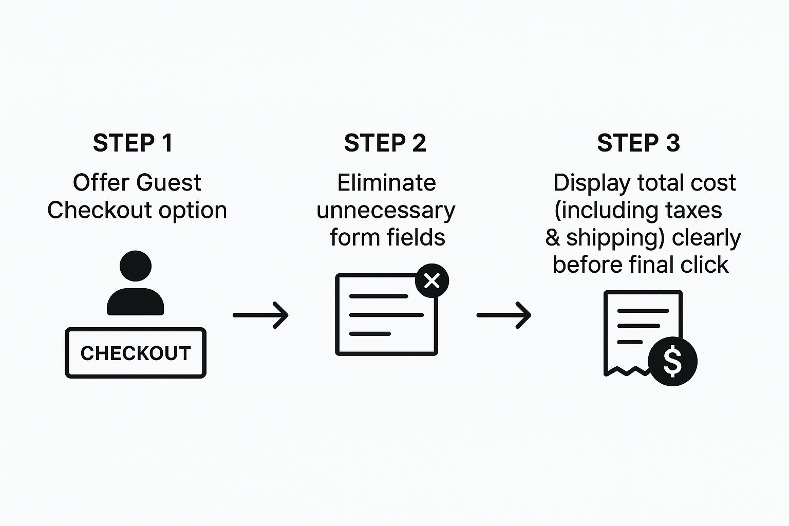
This visual guide puts it perfectly: a streamlined checkout is all about offering flexibility and killing friction before that final click.
And here's one of the biggest conversion killers: forcing users to create an account. Many first-time customers just aren't ready for that commitment. You should always offer a prominent guest checkout option. You can always invite them to create an account on the "thank you" page right after their purchase is complete.
Nobody likes surprises, especially when it involves their money. Unexpected costs popping up at the last second are the #1 reason for cart abandonment. Being transparent isn't just good practice; it’s how you build trust when it matters most.
Before anyone is asked to pull out their credit card, they need to see the full, final cost—including all taxes and shipping fees. You can use an IP-based location detector to estimate these costs early on and give people clear options for different shipping speeds.
Here's a quick look at some of the most common issues that crop up during checkout and how you can fix them.
| Friction Point | Impact on Conversions | Recommended Solution |
|---|---|---|
| Forced Account Creation | High abandonment rate | Offer a clear and easy guest checkout option. |
| Surprise Shipping Costs | The top reason for cart abandonment | Show estimated shipping costs in the cart, not just at the final step. |
| Long, Complex Forms | User frustration and drop-offs | Remove all non-essential fields (e.g., 'Company Name', optional phone number). |
| Limited Payment Options | Lost sales from users who prefer digital wallets | Integrate PayPal, Apple Pay, Google Pay, and other popular payment methods. |
| No Progress Indicator | Customer anxiety and uncertainty | Use a simple visual progress bar for multi-step checkouts (e.g., Shipping > Payment > Review). |
Tackling these points head-on can make a massive difference in how many people complete their purchase. It's all about making the customer feel secure and in control.
To boost confidence even further at this crucial stage, make sure you:
By focusing on simplicity, transparency, and speed, you turn your checkout from a final obstacle into a seamless conclusion to a great shopping experience. And that means more customers make it all the way to conversion.
When you dive into the world of conversion rate optimization, a lot of questions pop up. We get it. Here are the answers to the most common ones we hear from brands who want to turn more website window-shoppers into loyal customers.
Everyone wants to know the magic number, and the industry benchmark usually floats somewhere between 2% and 4%. But honestly, that number can swing wildly depending on what you sell.
A high-end furniture store isn't going to convert at the same rate as a shop selling affordable skincare. The price points and the amount of thought a customer puts into the purchase are just too different.
The best approach? Stop chasing a universal number and start competing with yourself. Focus on beating your own historical data first. Once you're seeing steady growth, then you can peek at what your direct competitors are doing. Oh, and keep in mind that mobile users typically convert at about half the rate of desktop users—a crucial detail when you're digging into your analytics.
Don't get hung up on a single "good" number. The only benchmark that truly matters is your own past performance. Aim for consistent, small improvements. That’s the real secret to sustainable growth.
Your product pages are your final, most important sales pitch. This is the moment a customer decides to either hit "Add to Cart" or bounce. To seal the deal, you have to build undeniable confidence and answer every single question they might have.
It all starts with killer visuals. We’re talking multiple high-quality photos from every angle, lifestyle shots showing the product in use, and even quick videos. Upfront, crystal-clear pricing is also non-negotiable. Nobody wants to be surprised by hidden fees when they're ready to buy.
But the real MVP? Genuine customer reviews. Seeing that real people bought and loved the product is the most powerful social proof you have. And since over 70% of shoppers are now browsing on their phones, making sure these pages look and work flawlessly on a small screen is absolutely essential.
You'd be surprised how often the smallest, simplest tweaks deliver the biggest wins. It usually comes down to reducing friction and making a shopper feel more secure.
Here are a few high-impact tactics you can put into action today:
Broken links, 404 error pages, and slow-loading sites are silent conversion killers. They might seem like small annoyances, but they chip away at trust and create a frustrating experience that sends potential customers running to your competitors.
Think of it this way: a broken link is like walking into a physical store and finding a key aisle completely blocked off. A slow mobile page is like trying to shop in a dark, cluttered room.
The data doesn't lie: studies show that 53% of mobile visitors will ditch a page if it takes longer than three seconds to load. Before you even think about spending more money on ads, make sure your site's foundation is solid and these technical issues are squashed.
At Jackpot Candles, we believe the thrill of discovery can turn a simple purchase into an unforgettable experience. Explore our collection of premium soy candles, each with a surprise piece of jewelry hidden inside, and see how we create moments of delight that keep customers coming back. Discover your hidden gem today at https://www.jackpotcandles.com.
Comments will be approved before showing up.