free shipping at $99


Think of your candle label as more than just a sticker. It’s the very first thing a potential customer sees, their initial handshake with your brand. Long before they even unscrew the lid to take a whiff, that little piece of paper has already started telling a story. It’s your silent salesperson, working hard to convey quality, personality, and why your candle is the one they have to take home.
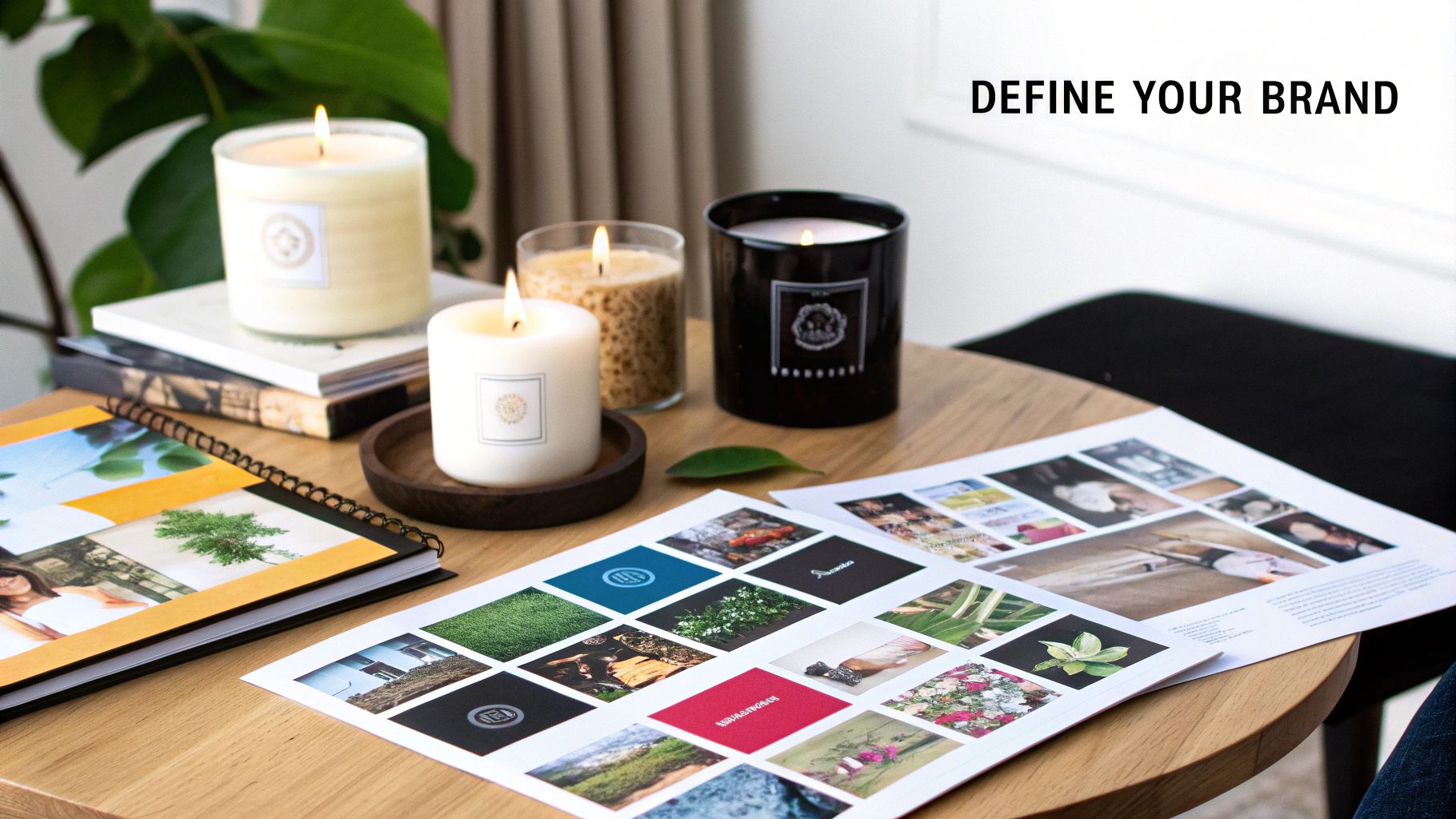
In a market overflowing with options, your label is the most critical visual real estate you have. It's what makes someone stop scrolling on their phone or reach for your candle on a packed shelf. A great label does all the initial heavy lifting.
Imagine walking down an aisle. A candle with a minimalist design and crisp, clean fonts might whisper "luxury" and "sophistication." Right next to it, one with rustic, earthy colors and a hand-drawn illustration gives off a completely different vibe—maybe it's all-natural, cozy, and perfect for a cabin retreat. Every design choice you make shapes what a customer believes about the product inside.
Ultimately, your label is a powerful branding tool. It's your chance to forge an instant emotional connection. What feeling are you selling? Is it calming self-care? Vibrant, party-starting energy? Or maybe a dose of sweet nostalgia?
Your label should scream this from the shelf through a few key elements:
A well-thought-out label does one more crucial thing: it builds trust. It shows your customers that you’ve poured care and attention into every single detail of your product, from the wax and wick right down to the final presentation.
Below is a quick breakdown of the key elements every effective candle label should have. Think of this as your essential checklist for creating a label that not only looks good but also does its job.
| Key Elements of an Effective Candle Label | ||
|---|---|---|
| Element | Purpose | Example |
| Brand Name/Logo | Establishes brand recognition and makes your product memorable. | Luminara Candles |
| Scent Name | Clearly communicates the fragrance to the customer. | Vanilla Bean & Marshmallow |
| Net Weight | Provides mandatory product information and manages expectations. | 8 oz (227g) |
| Candle Type | Informs the customer about the materials used. | 100% Soy Wax Candle |
| Contact Info/Website | Builds trust and allows customers to find you again. | www.luminaracandles.com |
| Warning Label | Ensures safety and complies with legal requirements (usually on the bottom). | Burn within sight. Keep away from flammable objects. |
Getting these elements right is the foundation of a label that truly works for your brand.
Because your candle label is such a huge piece of your brand's puzzle, it’s worth taking the time to learn how to build a strong brand identity. With the global candle market projected to hit USD 16.3 billion by 2033, creating a unique and memorable brand has never been more important for standing out and finding success.
So, you’re ready to create a gorgeous label for your candle. You might be thinking you need a high-end design studio or a bunch of expensive equipment, but I’m here to tell you that’s not the case. Getting a professional-looking result right from your desk is totally achievable with the right combo of user-friendly software and quality materials.
First up, let's talk about design software. If you're just starting out, a platform like Canva is a game-changer. It’s incredibly intuitive and comes loaded with templates, fonts, and graphics made specifically for labels. It really takes the guesswork out of the creative process.
This is a peek at Canva's template library. As you can see, it makes it super easy to jump in and start designing, even with zero experience. Now, if you find yourself needing more advanced tools, like creating custom illustrations from scratch or doing really intricate typography, then something like Adobe Illustrator offers that next-level control. Just be prepared for a bit of a learning curve.
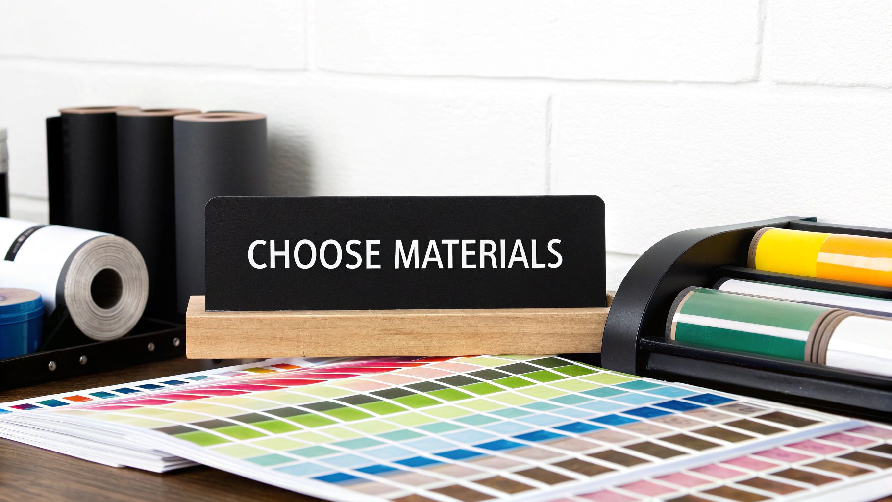
The paper you choose for your label is just as crucial as the design itself. It's what gives your candle its final look and feel, and it determines how well the label holds up over time. This choice can even tie into your candle's story. For instance, the type of wax you use can influence your branding, which we dive into in our article on why we use soy wax.
Here are a few popular options I've seen work really well:
A word of advice from experience: don't print a beautiful design on standard office paper. It just doesn't have the right adhesive or durability for a candle. It will almost always end up peeling, smudging, and looking unprofessional, which completely undermines all your hard work.
Finally, a quick thought on hardware. Any reliable inkjet or laser printer will do the trick for getting those colors to pop. When it comes to cutting, a simple paper trimmer is fine for straight-edged labels. But if you want to get creative with unique, custom shapes, a craft cutting machine like a Cricut is a fantastic investment for getting those perfect, precise cuts every time.
 This is where the magic really happens. You're moving beyond just listing ingredients and are starting to tell a story. When you create your own candle label, you’re actually crafting the first impression—an entire experience before anyone even lights the wick. Your design is a promise of the mood and aroma waiting inside that jar.
Think of your design elements like ingredients in your wax. Color is easily one of the most powerful tools you have. A "Sandalwood & Amber" candle just begs for a palette of warm, earthy tones like terracotta, deep brown, and maybe a pop of muted gold. On the flip side, a "Sea Salt & Orchid" scent would feel right at home with crisp blues, soft whites, and cool greens.
Once you’ve nailed down your colors, typography steps in to give your brand a voice. The font you pick can instantly signal a feeling. A clean, sans-serif font like Helvetica or Futura feels modern and minimalist—perfect if you're going for a sleek, sophisticated vibe. On the other hand, a classic serif font like Garamond or a flowing script can make things feel more traditional, cozy, or lovingly handmade.
Don't be afraid to mix two fonts that complement each other. This is a classic design trick to create a visual hierarchy, guiding your customer's eye exactly where you want it to go. Your most important info—the brand name and the scent name—should always be the most prominent.
Pro Tip: Try a bold, eye-catching font for your scent name and something more subdued and smaller for secondary details like net weight or "100% Soy Wax." This makes sure the most critical information is seen first, making your label easy to scan on a crowded shelf.
To pull everything together into a cohesive design, keep these elements in mind:
A great label design feels balanced and intentional. Every single element, from a tiny hand-drawn leaf to the spacing between letters, adds to the overall story you're telling. As you focus on your label, it can also be super helpful to look at broader principles for designing beautiful and effective packaging online to really make your product shine.
Ultimately, you want to create a label that feels like a natural part of the candle itself. When a customer picks it up, the design should just make sense, aligning perfectly with the name, the scent, and the quality they expect from you. This thoughtful approach is what turns a simple product into a truly desirable object.
While your gorgeous label design is what will catch a customer's eye, it’s the fine print that builds trust and keeps them safe. When you create your own candle label, thinking about safety and legal info isn't just a good idea—it’s an absolute must. Getting this right protects your customers and, ultimately, your business.
This critical information usually lives on a separate warning label, tucked away on the bottom of the candle. The goal here is clarity and prevention.
Your warning label needs to be simple, direct, and impossible to misunderstand. Industry standards, like those from the ASTM (American Society for Testing and Materials), give us a clear playbook on the required text and symbols.
At a minimum, your label has to include these core safety instructions:
I’ve found that universal fire safety pictograms are a game-changer. They communicate danger in a split second, even if someone doesn’t read the text. It's an extra layer of protection that shows you're serious about safety.
Now for the main event—your front-facing label. This is where your brand personality shines, but it also has a job to do. To be compliant and transparent with your customers, you need to clearly display a couple of key details.
First, your business identity. This means your business name and location (city and state usually do the trick). It tells people who's behind the amazing candle they're about to buy.
Second, the net weight. You’ll need to list this in both ounces (oz) and grams (g). For example: 8 oz (227g).
Nailing these details shows you’re a professional who cares about quality. As more people look for products that fit a healthy lifestyle, this kind of transparency really matters. You can learn more about how different waxes play into this by checking out why soy wax is better than paraffin. Highlighting eco-friendly materials is a great way to connect with this growing market.
While product-specific rules are vital, it's also helpful to have a general awareness of compliance design. For example, looking into the essential emergency exit signage requirements can offer some surprising insights into creating clear, effective, and legally sound visuals in any context.
Okay, your design is officially done—now for the fun part! It's time to take that digital file and turn it into a real, physical label that looks just as good on the jar as it does on your screen. This is where a little patience and precision really pay off, transforming your creation into a truly professional-looking product.
Before you hit "print," take a second to check your printer settings. You'll want to select the highest quality option, often labeled "Best" or "Fine." Also, make sure you tell the printer what kind of paper you’re using, whether it's glossy, matte, or something else. This quick step is crucial for getting those rich, vibrant colors you worked so hard to pick out.
The image below breaks down the key moments in this final stage, from printing to the finished product on your candle.
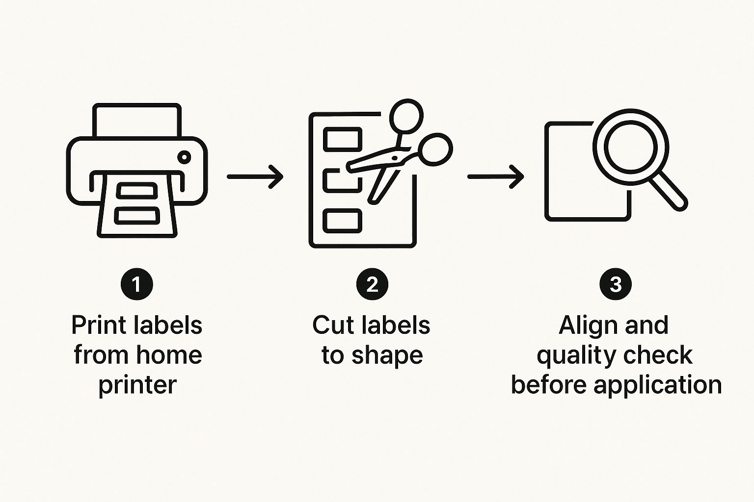
As you can see, a little quality control at each step goes a long way.
When it comes to cutting, you have a couple of options. For simple, straight-edged labels, a standard paper trimmer will work just fine and give you clean lines. But if your design has custom curves or intricate shapes, a cutting machine like a Cricut is a game-changer. It delivers perfect, clean cuts every single time.
Pro Tip: Here’s my secret for making labels stick for good. Before you even think about placing the label, give the candle jar a quick wipe-down with isopropyl alcohol on a cotton ball. This completely removes any lingering dust, oils, or fingerprints, giving the adhesive a perfectly clean surface to grab onto. No more peeling corners!
Ready to apply? The trick is to start from the middle and work your way out. Gently place the center of the label onto the jar first. Then, using your thumb, smooth it down from the center to the edges. This "center-out" technique is your best defense against pesky air bubbles and wrinkles.
A perfectly smooth label just screams quality, and taking these extra steps ensures your customers have the best experience. For more tips on making that experience last, check out our guide on how to make candles last longer.
Even the best application can sometimes go wrong. It happens to everyone! I’ve put together a quick troubleshooting table to help you fix some of the most common issues you might run into.
| Problem | Cause | Solution |
|---|---|---|
| Bubbles or Wrinkles | Air was trapped under the label during application. | Peel back the label slowly to where the bubble starts. Reapply, smoothing from the center outward with a credit card or squeegee. |
| Label is Crooked | The label was not aligned properly before pressing down. | Use a ruler or a faint pencil line as a guide. Start with very light pressure so you can reposition it if needed. |
| Edges are Peeling | The jar surface was not clean, or the label adhesive is weak. | Wipe the jar with isopropyl alcohol before applying. If peeling persists, consider a stronger adhesive label paper for your next batch. |
| Colors Look Faded | The printer settings were on "Draft" or "Normal," or the wrong paper type was selected. | Always print on the "Best" or "High-Quality" setting and ensure the paper type in the settings matches your actual label paper. |
Don't get discouraged if your first few tries aren't perfect. With a little practice, you’ll be applying labels like a seasoned pro in no time, giving your candles that beautiful, polished finish they deserve.
When you first start to create your own candle labels, it's totally normal to hit a few snags. I've been there! Getting the details right—from the materials you use to the colors you print—is what turns a good candle into a great one. Let's walk through some of the most common questions that pop up.
One of the first hurdles is always the label material itself, especially if you picture your candles in a steamy bathroom. You need something that can handle the humidity.
For labels that are truly waterproof and oil-resistant, your best friends are BOPP (Biaxially-Oriented Polypropylene) or classic vinyl. These materials are tough. They won't smudge if a bit of fragrance oil gets on them, and they'll fight off peeling, keeping your design looking sharp.
Another common frustration? Getting the colors on your printed label to actually match what you designed on your screen. There’s nothing worse than spending hours on a beautiful design, only to have the printed version look dull or just... off.
A good first step is to calibrate your monitor. When you're in your design software, make sure you're working in CMYK color mode, since that's what most professional printers use.
But honestly, the most crucial step is to always do a test print. Before you run a whole batch, just print a single label on the exact paper you plan to use. This one small action can save you a ton of money and headaches, giving you a chance to tweak things before you commit.
Finally, let's talk about safety, because it's non-negotiable. A proper warning label is an absolute must for any candle you make. It's all about protecting your customers and, by extension, your brand.
This label typically goes on the bottom of the candle and needs to have the key fire safety warnings. Think clear, simple instructions like "Burn within sight," "Keep away from flammables," and "Keep away from children and pets."
Ready to design a candle that’s truly one-of-a-kind? With Jackpot Candles, you can create personalized candles featuring your own photos and labels for any occasion. Start designing your custom candle today!
Comments will be approved before showing up.