free shipping at $99


It’s a scenario we all know too well. A customer finds a Jackpot Candle they absolutely love, adds it to their cart, gets to the checkout... and then they’re gone. Poof. Vanished.
This isn’t just a small bump in the road; it’s a major leak in your revenue pipeline. Before we can start plugging those leaks, we need to understand what’s really going on when a shopper decides to walk away.
Globally, the average cart abandonment rate is a jaw-dropping 69.99%. Think about that for a second. Nearly 7 out of every 10 shoppers who are excited enough to add a candle to their cart never actually buy it. For e-commerce stores, this adds up to an estimated $18 billion in lost sales every single year.
That number might seem intimidating, but I see it as a huge opportunity. For a brand like Jackpot Candles, where the excitement of the jewelry reveal is a core part of the experience, every abandoned cart is a story that didn’t get to its happy ending.
So, let's look at the main culprits.
Here’s a quick overview of the most frequent reasons customers leave and the corresponding strategies we'll cover in this guide to win them back.
| Abandonment Trigger | Customer Experience Impact | Effective Solution |
|---|---|---|
| Unexpected Costs | Creates "sticker shock" and feels deceptive, breaking trust right at the end. | Offer transparent shipping costs upfront and provide free shipping thresholds. |
| Complex Checkout | Causes frustration and makes the process feel like a chore, killing excitement. | Streamline with guest checkout options and a single-page process. |
| Forced Account Creation | Feels like an unnecessary barrier, especially for new or impatient customers. | Allow guest checkout and offer an optional account creation post-purchase. |
| Lack of Trust | Raises security red flags, making shoppers hesitant to share payment info. | Display security badges, customer reviews, and clear return policies. |
| Poor Mobile Experience | Leads to difficulty navigating, tapping small buttons, and entering info. | Optimize for mobile-first design with large buttons and simple forms. |
This table gives us a great starting point. By understanding these core pain points, we can begin to craft a checkout experience that feels seamless, trustworthy, and genuinely focused on the customer.
When you dig into the data, most abandoned carts trace back to one of three fundamental problems. I like to think of them as the primary villains of e-commerce conversion.
Hidden Costs and Sticker Shock: This is, without a doubt, the number one reason people bail. A customer is thrilled with their $30 candle, but when they hit the final page and see $9 for shipping and taxes, that thrill instantly fades. It feels like a bait-and-switch, creating anxiety and making them question the entire purchase.
Friction and a Clunky Checkout: A long, confusing, or just plain annoying checkout is a conversion killer. If someone has to create an account from scratch, fill out a dozen form fields, and battle a clunky mobile interface, their excitement turns to frustration. Every extra click is another chance for them to rethink their decision.
A Lack of Trust and Security: In the online world, trust is your most valuable currency. If your site looks a bit dated, doesn't have clear security seals (like an SSL certificate), or your return policy is buried somewhere, shoppers will get nervous. For a new customer, even a tiny hint of insecurity is enough to send them running to a competitor.
By framing cart abandonment not as a single event but as a symptom of deeper issues—cost anxiety, user frustration, or a trust deficit—you can begin to build a more resilient and profitable checkout experience.
Understanding these foundational issues is the first real step toward improving eCommerce conversion rates and turning more of those curious browsers into loyal, happy customers. Now, let’s get into the good stuff: the actionable strategies to fix these problems for good.
You can’t improve what you don’t measure. Before you start tweaking buttons or rewriting copy, you need to play detective and use data to find exactly where your customers are dropping off. Flying blind and trying random fixes is a recipe for wasted time. A data-driven approach, on the other hand, lets you zero in on the biggest leaks in your sales funnel.
This is where a tool like Google Analytics 4 (GA4) becomes your best friend. By setting up a conversion funnel, you're essentially creating a map of the customer's journey, turning abstract clicks into a clear, actionable story.
A conversion funnel tracks the specific steps a shopper takes on their way to making a purchase. For an e-commerce store like Jackpot Candles, a typical path looks something like this:
Setting this up in GA4 shows you the exact percentage of people who disappear at each stage. This isn't just data; it’s a roadmap telling you precisely where the roadblocks are.
By visualizing your checkout process as a series of steps, you can move from guessing what’s wrong to knowing exactly where the customer journey breaks down. This focused insight is the key to making impactful changes.
For example, you might discover that while 90% of users who add a candle to their cart proceed to checkout, only 40% of them ever get past the shipping information step. That's a huge red flag! It immediately tells you the problem isn't your product pages or the cart itself—it's almost certainly something to do with your shipping costs or how you present them.
This graphic breaks down a few of the usual suspects, which often line up perfectly with the drop-off points you'll find in your own analytics.
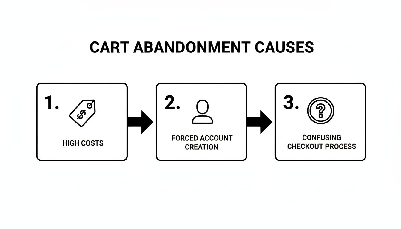
As you can see, surprise costs, making people create an account, and a clunky process are major friction points that cause shoppers to flee.
Once your funnel is collecting data, it's time to dig in and understand the why behind the numbers. Don't just glance at the overall drop-off rate. Segment your data to spot more specific patterns.
Key Metrics to Analyze:
Turning these raw numbers into a prioritized list of issues lets you tackle the real problems hurting your sales. Your analytics report becomes your playbook, guiding every UX fix and recovery tactic you put in place.
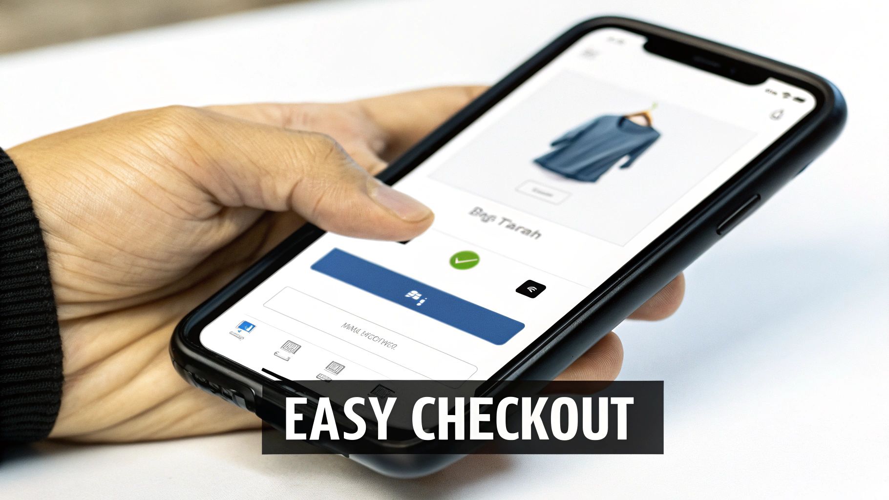
Once a customer pops a Jackpot Candle into their cart, that final stretch to purchase should feel like an easy, satisfying glide to the finish line. A lot of online stores trip up right here, turning an excited buyer into a frustrated statistic with clunky, unnecessary hurdles. A frictionless checkout isn’t about flashy design; it’s about ruthlessly cutting out every single point of friction.
The number one conversion killer at this stage? Forced account creation. I've seen the data time and again: 26% of shoppers will ditch their cart if you make them create an account. For a new customer, it just feels like a pointless delay and an unwanted commitment. They'll leave before you ever see their payment details.
The fix is surprisingly simple: always, always offer a guest checkout option. This lets shoppers head straight to payment with only the essentials—their name, email, and where you're sending the goods.
By making guest checkout the most obvious path forward, you show that you respect their time and are making it as easy as possible to buy. You can always invite them to create an account on the "Thank You" page after the sale is complete, framing it as a handy shortcut for next time.
Get the sale first, build the relationship second. Think of guest checkout as the express lane for new customers. You build trust with a seamless first purchase, which is way more valuable than forcing an account signup.
This whole approach just gets it: their immediate goal is to buy your candle, not to get another password to remember.
Beyond guest checkout, a few other design tweaks can make a massive difference. Think of your checkout page as a clearly marked, well-lit path. No one should feel lost or confused.
Key UX Enhancements to Implement:
These small changes add up to a checkout process that feels faster and more intuitive, especially for mobile shoppers who are often trying to buy on the go.
These days, just offering credit cards isn't going to cut it. Shoppers have their go-to payment methods, and not seeing their favorite can be a dealbreaker for 13% of users. The name of the game is flexibility and familiarity.
Make sure you’re integrating the payment options people know and love.
When you display these trusted payment logos, you're not just offering convenience. You're also borrowing their credibility, which helps build even more trust in your store. To really dial in your process, check out these actionable Conversion Rate Optimization tips that can help you plug any remaining leaks. Every little improvement you make adds up to a smoother journey and turns would-be abandoned carts into happy, loyal customers.
When a customer is right on the edge of buying, the last thing you want is for a flicker of doubt to creep in. For a product like a Jackpot Candle—which is all about the experience and the thrill of a surprise—trust is everything. If a shopper feels even a little unsure about security, shipping costs, or the quality of their jewelry reveal, they'll hesitate.
And that hesitation is a total conversion killer. The checkout page is your last chance to dissolve any lingering anxiety. You have to be completely transparent and show them they're in good hands. It’s all about making them feel secure and confident in their decision to buy from you.
Let's be real: nobody likes surprise fees. It's the number one reason people ditch their carts. In fact, research shows a whopping 48% of users will leave if they get hit with unexpected shipping costs, taxes, or other charges at the very end. It just feels sneaky and can undo all the goodwill you’ve built.
The fix is simple: show them all the costs upfront. Don’t make them wait until the final payment screen to find out what shipping will be.
Here's how you can make that happen:
A customer who knows the full cost early on is mentally prepared to click "buy." Transparency isn't just nice to have; it's a core strategy for slashing your cart abandonment rate.
In those final moments before they enter their credit card info, customers are subconsciously looking for signs that your store is legit and their data is safe. This is where trust signals come in. They act as little visual reassurances that calm any last-minute nerves. It's no surprise that 25% of shoppers get spooked and abandon their carts because of security concerns.
These little badges aren't just for decoration; they're powerful tools for building confidence right when it matters most.
Since you're selling Jackpot Candles, you have a unique opportunity to take this a step further. Try adding a "Jewelry Reveal Guarantee" message near the "Complete Order" button. It could be a short, confident statement promising quality and authenticity for the jewelry inside. This reinforces your unique value at the perfect moment, layering brand-specific trust on top of standard security signals. It's a powerful combo that eases anxiety and gets shoppers excited to click that final button.

Even with the smoothest checkout process, some shoppers will get distracted and wander off. Life happens. But a lost visitor doesn't have to mean a lost sale. This is where your recovery strategy comes in—a smart, automated system designed to bring interested shoppers back to finish what they started.
These campaigns really work. Data shows abandoned cart emails can bring in an average revenue of $5.81 per recipient. For a business built on the excitement of discovery like Jackpot Candles, this is the perfect chance to give customers a gentle nudge and remind them of the unique experience they’re about to miss.
A single "You left something behind!" email is better than nothing, but a strategic, multi-step sequence is way more powerful. The goal is to build on their initial interest without being pushy, evolving the message with each email. A well-timed series can dramatically boost your chances of getting that sale back.
To get a head start, check out these proven abandoned cart email templates that are designed to recover lost purchases. They're a fantastic foundation for building your own high-converting sequence.
Here’s a three-part email sequence that works wonders for a store like Jackpot Candles:
Email 1: The Gentle Reminder (Sent within 1 hour): Timing is everything. Your first email should land in their inbox while the purchase is still fresh in their mind. Keep it simple, friendly, and helpful. A subject line like, "Did you forget something?" with a clear picture of the candle in their cart and a direct link back to checkout is perfect. Think of it as a helpful service, assuming they just got sidetracked.
Email 2: The Value Reinforcement (Sent at 24 hours): After a day, it’s time to shift from a simple reminder to reigniting their excitement. This email is all about the why. Remind them about the premium soy wax, the luxurious fragrance, and most importantly, the surprise jewelry waiting inside. A subject line like, "Your surprise jewelry is waiting to be discovered!" can be incredibly effective.
Email 3: The Compelling Offer (Sent at 48-72 hours): If they still haven’t come back, they probably need an extra push. Now’s the time to introduce a small, time-sensitive incentive. An offer of 10% off or free shipping can be just the nudge they need to seal the deal. Frame it as a special offer to help them complete their order and create a little urgency.
A great recovery email doesn’t just say "come back." It reminds the customer of the unique value and emotional experience they were drawn to in the first place, turning a simple transaction into an exciting event.
While email is the foundation of any good recovery plan, SMS messages offer a powerful, immediate alternative. With open rates often soaring above 90%, a well-timed text can cut through the noise and grab a customer’s attention instantly.
But remember, SMS is a more personal channel, so you have to use it wisely. Only send texts to shoppers who have explicitly opted in for them. A simple, friendly text sent a few hours after they abandon their cart can work like a charm.
Example SMS Message:
"Hi [Customer Name]! It looks like you left a Jackpot Candle in your cart. Your surprise jewelry is waiting! You can complete your order here: [Link]"
This approach is direct, personal, and gives them an immediate path back to their cart. It's a low-effort, high-impact way to recapture attention. Over time, these small wins add up and are a great way to increase customer lifetime value by keeping them engaged.
For shoppers who don’t respond to emails or texts, retargeting ads on social media platforms like Facebook and Instagram are your final line of defense. These ads let you display the exact product they abandoned right in their social feed, keeping your brand top-of-mind.
Your ad creative should be beautiful, showcasing the candle and maybe even some stunning jewelry reveals from other happy customers. Pair these visuals with copy that echoes your email campaign—highlighting the dual value of a premium candle and a gorgeous piece of jewelry. By meeting them where they spend their time, you create another valuable touchpoint that can guide them right back to your store.
Of course. Here is the rewritten section, crafted to sound like an experienced human expert and match the provided examples.
Feeling stuck on cart abandonment? It's a universal headache for e-commerce stores, but you're not alone. Let's walk through a few of the most common questions I hear from store owners and clear things up with some practical, real-world advice.
You’ll see a global average of around 70% thrown around, and frankly, it's a scary number. But don't get too hung up on it. For a unique store like Jackpot Candles, where the product has a built-in surprise, a more realistic initial target is somewhere in the 55-65% range.
The real goal isn't to hit some magic industry number. It's about beating your own number. First, figure out what your current abandonment rate is. Once you have that baseline, focus on chipping away at it. Even a small 5-10% drop can make a huge difference in your monthly revenue. Progress, not perfection.
Timing is everything. Wait too long, and that initial excitement your customer felt is gone. You’ve got to strike while the iron is hot.
The absolute sweet spot for that first email is within one hour. Any later, and you're likely leaving money on the table.
Think of it less as a hard sell and more as a helpful tap on the shoulder. Here’s a simple, proven sequence that works wonders:
Of course, you should always test these timings to see what your specific audience responds to best.
This is a huge fear for so many store owners, but let me put your mind at ease. Forcing someone to create an account is one of the fastest ways to lose a sale. More than a quarter of shoppers will ditch their cart if they’re forced to sign up.
Think about it: which is more valuable? Getting the sale right now, or forcing a sign-up and potentially losing the customer forever? The sale, every time.
Here's the trick: make guest checkout the easiest, most obvious option. Then, once the purchase is complete, ask them to create an account on the "Thank You" page. A simple message like, "Want to make your next order even faster? Save your details with one click," works like a charm. You get the sale without the friction and you still get the customer account for future marketing. It's the best of both worlds.
Ready to turn more browsers into buyers? At Jackpot Candles, we craft premium soy candles and bath bombs with a surprise piece of jewelry hidden inside, creating an unforgettable unboxing experience. Discover the perfect gift or treat for yourself and see what treasure you'll reveal. Explore our collection today at https://www.jackpotcandles.com.
Comments will be approved before showing up.